< BACK
branding & launch case study
Naming | brand identity |social media ads
DROWSY is a family-owned pop-up shop that sells ethically sourced, organic herbs that help induce sleep.
But before DROWSY was what you see here, it was a nameless & brandless idea.
Drawing inspiration from our many sleepless nights, we brainstormed fun and witty names and researched unusual sleep-inducing colors before developing 5 initial concepts. Most herbal & organic retail brands go for raw textures, greens and browns, and a holistic tone. So, that’s exactly what we didn’t do.
And though all of the concepts had a fun and modern take, none of them were as bold or as curious as DROWSY.
The fun colors are intriguing on their own (for the art nerds that may care: DROWSY’s base pink color is a twist on Baker-Miller Pink, a shade that has been clinically proven to reduce agitated behavior) but then you consider the meaning of the name; then the honest tone of the tired-eyed icon; then the clever composition of the stumbling typography – this leaves you with a couple of clues but no real context. Sure, it has something to do with sleep, but what exactly? Is it a meditation app? Or one of those overpriced silk pajama brands?
This ambiguity is particularly what drew us to DROWSY.
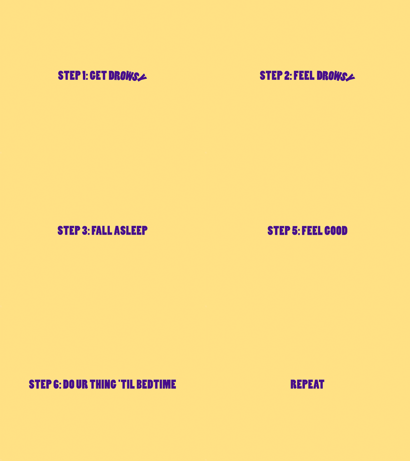
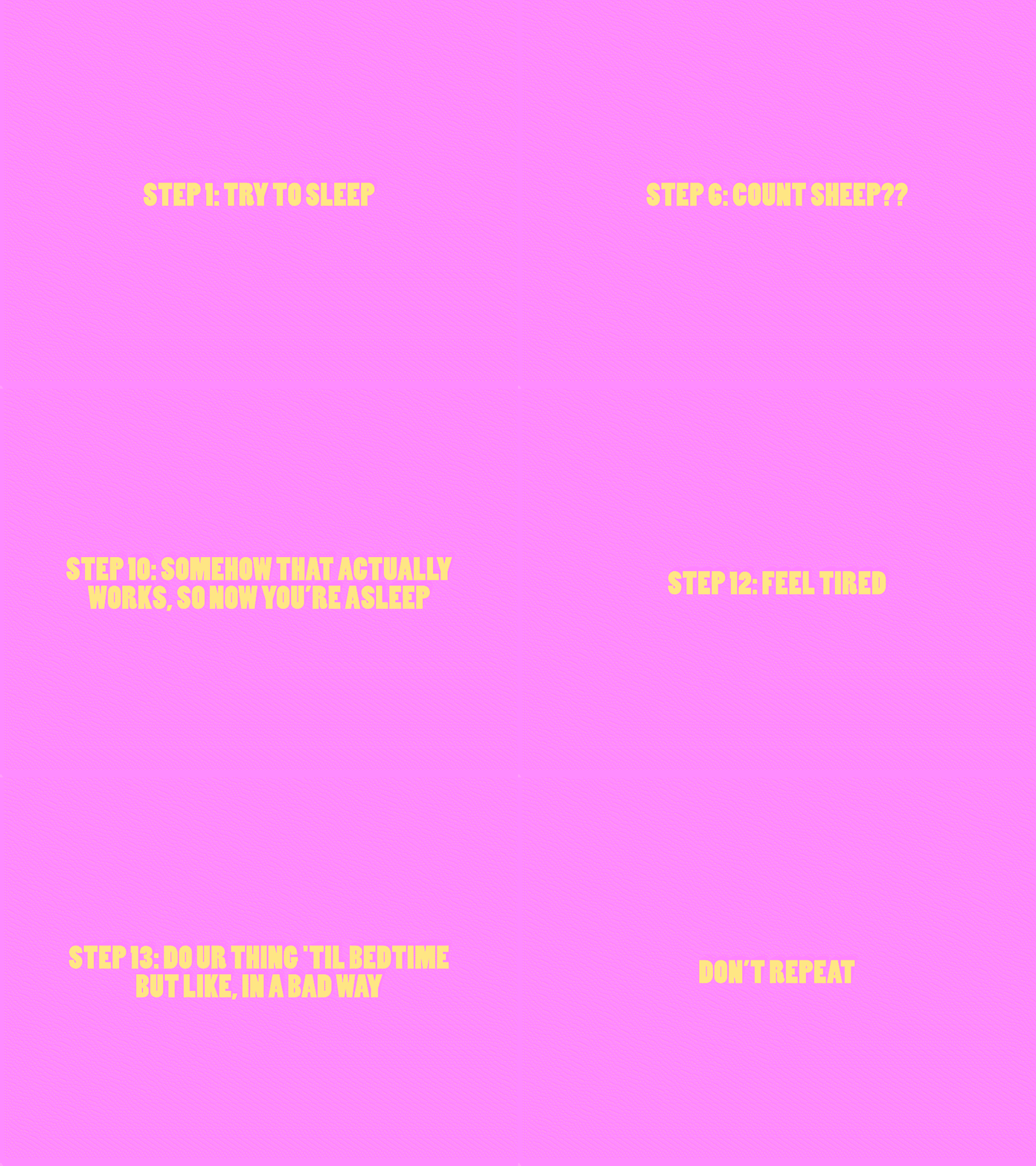
Once we got to the copywriting and ad development phase, we used the novelty of vagueness as the main tenet of our marketing angle. If we managed to create an intriguing and mysterious ad about a sleep-aid (which we did), and show them exclusively to sleepy people (which we also did), then they’ll have to at least click to check out the product offering.
DROWSY became unpretentiously creative and clever. It offered a solution without being patronizing.
And most importantly, it matched the eclectic minimalism of the business’ operations. DROWSY is locally owned and sells its products in person only. No online sales. No shipped orders. If you want to try it, you’ll have to visit a physical weekly pop-up to experience it for yourself.
NAMING & VISUAL TESTS
BRAND IDENTITY
Colors, logo, and iconography
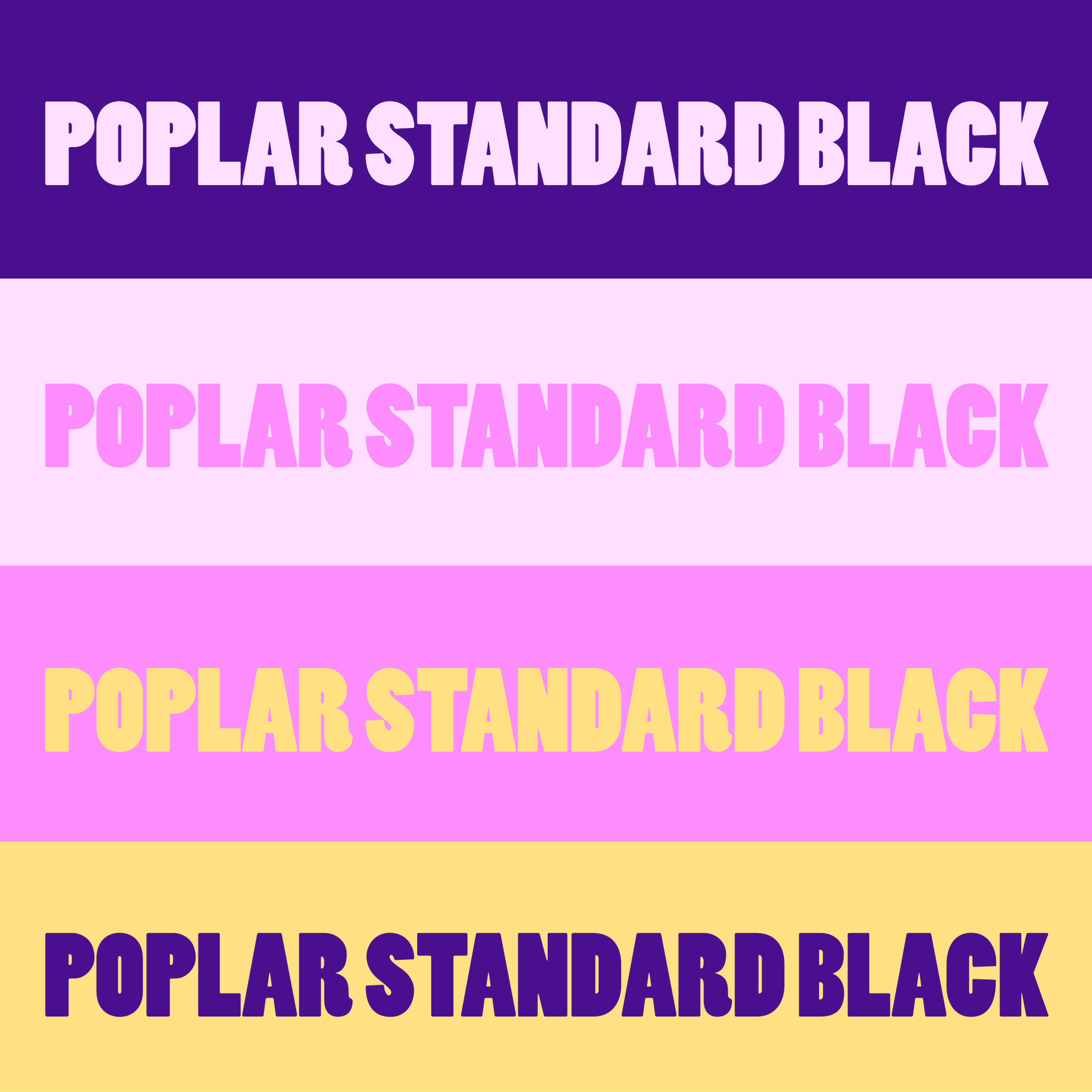
Fonts
SOCIAL MEDIA AD LAUNCH
OUR NEXT TASK WAS LAUNCHING THE BRAND WITH SOCIAL ADS THAT exclusively targetED insomniacs.
We did a bit (a lot) of research and took a calculated risk: late-night ad deployments.
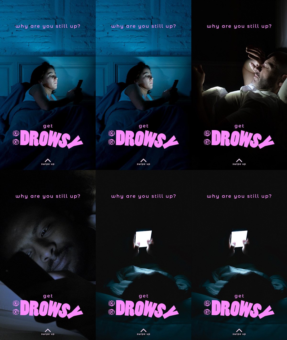
Between 1am-5am, we asked our ad viewers “why are you still up?” with clever stock images of people in bed on their phone. And though our ads were running for a shorter period of time and reaching less people than standard campaigns, the results were nuts.
19% CLICK THROUGH RATE
10% CONVERSION RATE
300% RETURN ON INVESTMENT


